Brand, Blue and a Copper Top

You don’t need to be a Williams Racing fan like me to be quietly purring over their 2026 livery.

Hard brief.. done well.

This is never a case of saying “make it look nice, Dave” to whoever leads the design team. There are some serious constraints at play. Principally, Williams’ natural colour.. that dark, confident blue.. and how it can be made to work with a set of heavyweight sponsors who didn’t arrive because their brand guidelines conveniently matched… though it certainly helps when they do.

Start with the title sponsor, Atlassian. Fortunately, their logo is either white on blue or blue on white. A perfect fit. No gymnastics required. Phew.

Next up, Komatsu. Yes, their heavy machines are famously yellow.. but the corporate logo? Blue on white, or white on blue. Once again, harmony. Once again, crisis averted.

Then there’s The Duracell Company. No blue-and-white sympathy here at all. And yet… what a stroke of design genius. Instead of forcing the logo to behave, Williams turned the airbox into an actual battery.. black casing, copper top, unmistakable. One of those ideas that’s so obvious after you’ve seen it that you wonder why nobody did it decades ago. Hats off.

Finally, the newcomer: Barclays. Their Spanish blue is noticeably lighter than the Williams shades of recent seasons. I’ll admit it jarred at first. But it’s growing on me. Correction.. it’s grown. It adds lift, contrast and a modern freshness without overpowering the car’s identity.

The result? A livery that feels coherent, confident, and quietly clever. Williams have integrated their key sponsors rather than simply accommodating them.. and I’d wager those sponsors are very happy indeed.

Now comes the hard part: taking it to the track… and keeping them that way.

Lovely to Have It Back

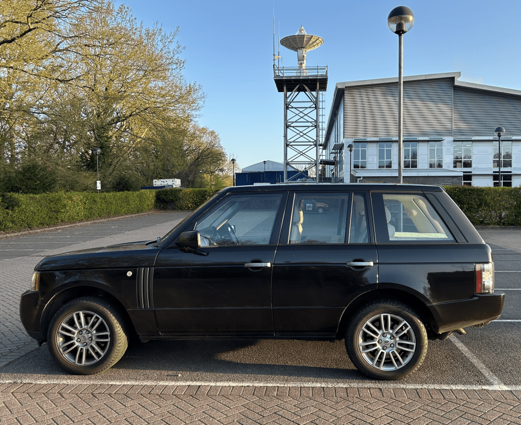
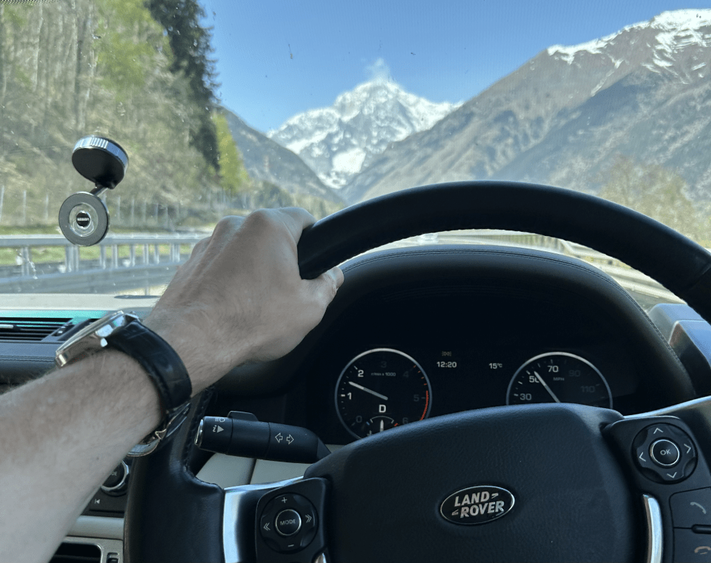
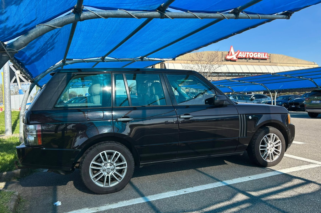
This morning I brought home my much-loved Range Rover from an unplanned winter holiday at the garage.

Deeply satisfying. Anxiety-busting, too.

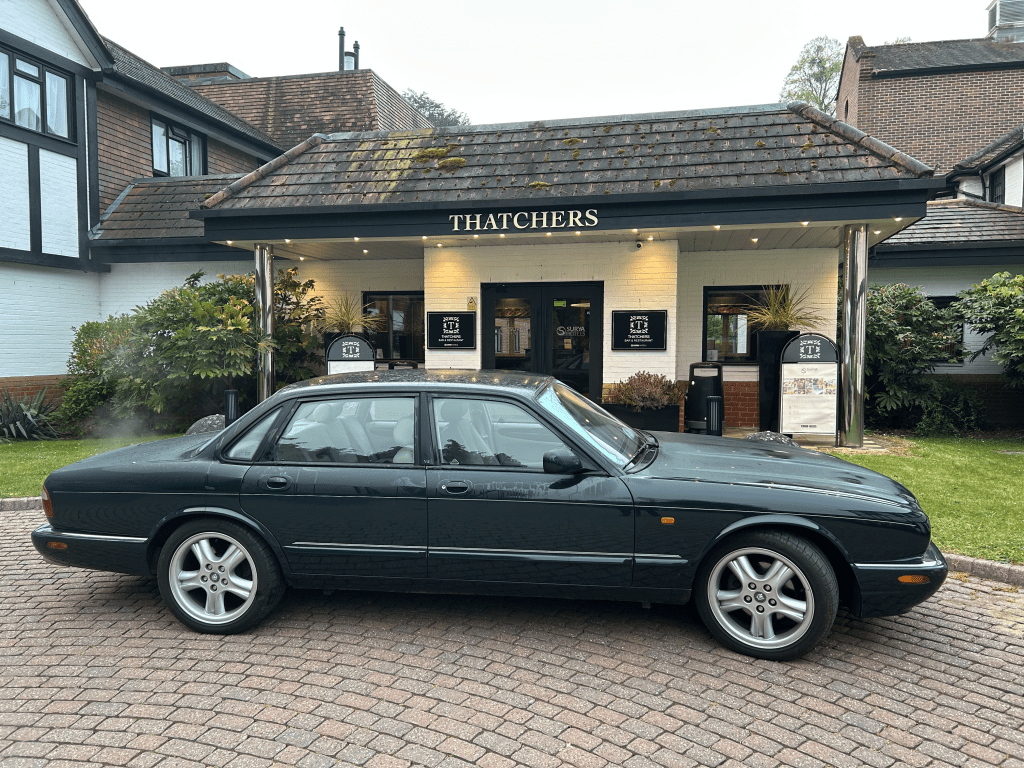
I alternate between two modern classics (ok… old cars) to get me down to Surrey for work. When one of them is down, I feel vulnerable. I am vulnerable. Because a couple of times a year I’ll get in one car and an “issue” means I have to swap over. A blown headlamp bulb on the Jaguar, for example. No time to fix it at 4:30am… only a minor inconvenience when the other car is there. A crisis when it isn’t.

When the Range Rover needed recovering from Surrey back to my Shropshire Land Rover specialist, I assumed the worst. A transmission warning light had bothered me twice in recent weeks. Cleared each time with a classic “turn it off and on again”… but still a niggle. I was braced for a gearbox. Turned out to be blocked fuel injectors. Still a chunky repair… but not gearbox territory.

If you run ageing vehicles, you reconcile yourself to them going wrong. Just as long as they don’t go wrong at the same time.

Cars cost money. You either buy expensive ones and move them on before they start going wrong – losing serious money in depreciation. Or you buy old ones “cheap” and then invest in extending their life when things break. I’m firmly in the second camp… but it’s a constant judgement call.

Let’s be honest. My only way into Range Rover ownership is buying an old one.

And I keep going to the window to look at it on the drive. Ridiculous behaviour for a grown-up. I was like this at ten years old with my first racing bike. That sleek Raleigh would have slept in my bedroom if Mum hadn’t feared oil on the carpet.

You don’t realise how attached you are to a car until it’s been unwell and off the road for a bit.

Lovely to have it back.

A Trend Worth Backing

I love the aesthetic of this old village garage in Hodnet, Shropshire.

Still pumping fuel and servicing cars in 2026.

You can almost picture the owner of this cottage, a century ago, noticing more and more horseless carriages rattling through the village and thinking:
This feels like a trend worth backing.

One hundred years later, it’s still here.. quietly doing its job.

Not all good businesses start with a grand vision.
Some just start with paying attention.

Some of the Best Adverts Have Wings

Are these racing cars, or complex adverts with wings and a wheel on each corner?

The answer is: both.

And for romantics like me, they’re also mechanical works of art and examples of iconic visual design.

Four of my all-time favourite Williams Racing liveries are pictured here.

With the 2026 reveal just days away, I’m curious to see if a new favourite is about to arrive.

Let’s see.

Flat White or F*ck Off

There’s a coffee pop-up in London tomorrow (28 January) called Flat White or F*ck Off.

They only sell one thing: flat whites.
And if you don’t want one of those… well, yes, you’ve guessed it.

The idea originated with marketing/ad guru Rory Sutherland – a frequent rail user – who was fed up with getting stuck behind someone ordering an elaborate iced concoction when he’s got a train to catch.

Now Tom Noble and Charlie Hurst are making the idea happen for real.

On the face of it, it’s a cheeky stunt. But underneath, it’s a neat real-world experiment in something I think more businesses should think about:

Confident specialisation.

Knowing what you’re great at.
Saying no to the rest.
Letting customers self-select.

In a world of endless options, there’s something refreshing about a business that takes a clear point of view.

Not just in coffee. In any industry. And I’m personally drawn to it.

A worthy endeavour.. even if I’ll get my flat white somewhere a bit more permanent.

(Who am I kidding… I’d definitely give Flat White or F*ck Off a try if I was passing!)

More Than Just Paint

It was the colour.

A hint darker than British Racing Green. Plain and honest. Not shouting “look at me”.. more like quietly saying “this is who I am.”

I’d been after a new bike for a while. Temple Cycles had them in my size in blue and beige. Mmmm, I think not.

This green was a special edition – unavailable in Large – until an ex-demo appeared. That was all it took. Sold.

Two of my cars are green. The third is a close rural cousin in brown. Same emotional territory.

We tell ourselves we make our transport purchases with logic: performance, efficiency, reliability, numbers.

The paint has no engineering value – and yet its shade carries a surprising amount of emotional weight in whether something feels right.

For me, colour isn’t just decoration.

It’s probably the deciding factor.

Properly Practical

I’m not particularly practical.

I can mow a lawn straight-ish.
Top my cars up with fluids.
Change a flat tyre or battery.
Keep my bike on the road.

And that’s probably about it.

Which is why I always find it uplifting to spend time with people who are properly practical.

Like the team at our composites manufacturing facility in Bordon. A small group, working in a very traditional British engineering environment – and doing so with a real sense of industrious camaraderie.

You can picture it.

Lathes.
Ovens.
Autoclaves.
Cutting tables.


This is where metal and composite parts are machined, bonded, etched, cured, prepared and stored – before ending up inside satellites that will orbit around 500 km above the Earth.

High-quality space hardware doesn’t just come from spotless cleanrooms or clever software.

It often comes from skilled hands, proven processes, and people who know how to shape raw materials into something that really matters – usually in modest industrial units on small industrial parks. Little more than sheds, really.

Lovely.

Results Fade. Beauty Lingers.

F1 teams are starting to unveil their 2026 cars.

And for me, it’s always about the livery. The look. The visual design.

Fast cars aren’t always beautiful.

And beautiful cars – like the ones pictured – aren’t always the fastest.

But if we’re still talking about them… still admiring them… still lusting after them, decades after the season was won or lost, then maybe choosing this design was the right decision after all.

Results fade. Beauty lingers.