You don’t need to be a Williams Racing fan like me to be quietly purring over their 2026 livery.
Hard brief.. done well.
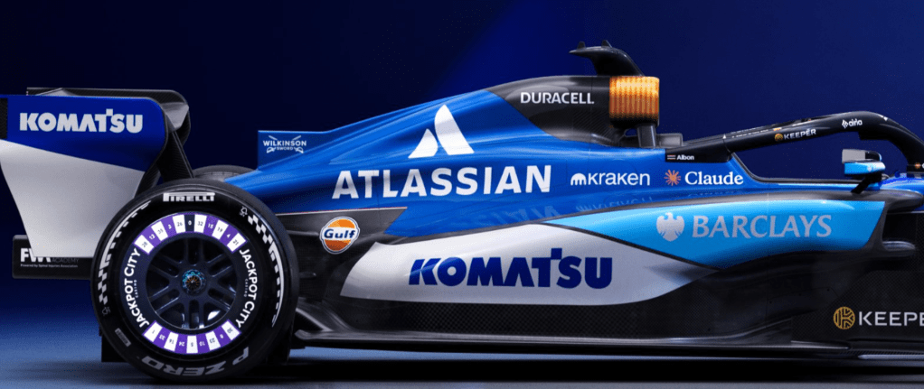
This is never a case of saying “make it look nice, Dave” to whoever leads the design team. There are some serious constraints at play. Principally, Williams’ natural colour.. that dark, confident blue.. and how it can be made to work with a set of heavyweight sponsors who didn’t arrive because their brand guidelines conveniently matched… though it certainly helps when they do.
Start with the title sponsor, Atlassian. Fortunately, their logo is either white on blue or blue on white. A perfect fit. No gymnastics required. Phew.
Next up, Komatsu. Yes, their heavy machines are famously yellow.. but the corporate logo? Blue on white, or white on blue. Once again, harmony. Once again, crisis averted.
Then there’s The Duracell Company. No blue-and-white sympathy here at all. And yet… what a stroke of design genius. Instead of forcing the logo to behave, Williams turned the airbox into an actual battery.. black casing, copper top, unmistakable. One of those ideas that’s so obvious after you’ve seen it that you wonder why nobody did it decades ago. Hats off.
Finally, the newcomer: Barclays. Their Spanish blue is noticeably lighter than the Williams shades of recent seasons. I’ll admit it jarred at first. But it’s growing on me. Correction.. it’s grown. It adds lift, contrast and a modern freshness without overpowering the car’s identity.
The result? A livery that feels coherent, confident, and quietly clever. Williams have integrated their key sponsors rather than simply accommodating them.. and I’d wager those sponsors are very happy indeed.
Now comes the hard part: taking it to the track… and keeping them that way.
